The Path of Moral Leadership Campaign Launch
Client: Acumen
Timeline: 1 month to design & go live May 5th
Timeline: 1 month to design & go live May 5th
Role: UX/UI Design, QA
Tools: Sketch, InVision
Tools: Sketch, InVision
Outcomes
Helped Acumen increase signs up, book purchases, financial aid applications, and total new account conversion rates with a marketing landing page for CEO Jacqueline Navogratz’ new course and book campaign.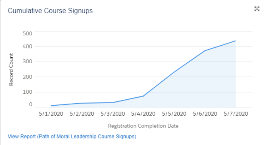
Context
On May 5th, 2020 Acumen launched the Alpha version of Acumen Academy, a re-branding of +Acumen. This marketing landing page was part of a marketing campaign to promote a new course The Path of Moral Leadership.

Photo ©Acumen Academy
Challenge
Acumen Academy’s average global user does not have credit and cannot afford a $195 online course.If Acumen Academy’s mission is to empower as many social entrepreneurs around the world with the teachings in this course, what are other avenues for them to access this education?
Solution
With this landing page, the team decided it was important to promote multiple payment options for users to gain access to this highly anticipated course by giving a 100% promotion codes with the purchase of the book or applications for financial aid.
 Payment options on landing page
 Promo code at Checkout
UI/UX Design - Marketing Landing Page
Wireframe Sketch
Before the decision to use a book promotion or offer financial aid I was given some basic criteria:
-
There would be a short form and long-form of this page
- One would be just for Jacqueline’s course and one to be used for other courses of lesser profile
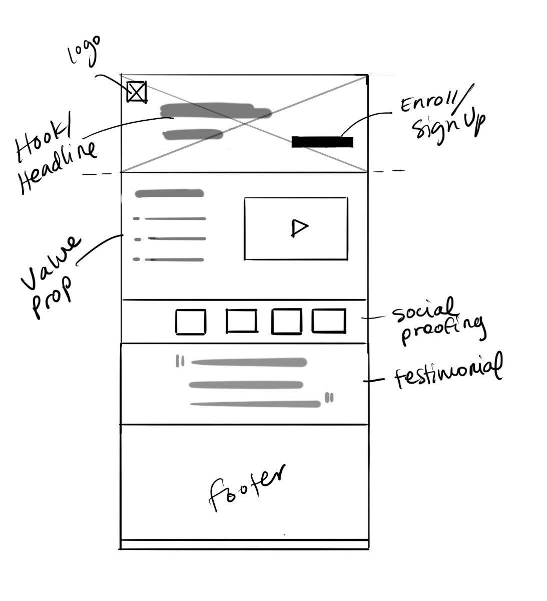
Low-Fidelity Wireframe
I began the foundation of of the page recycling as many components that developers had already implemented in other pages to meet our tight deadline.
The page includes design patterns found in our other landing pages:
-
a hero image above the fold with large heading
- social proofing
- testimonials
- content blocks with course description
- footer
I took some creative license and wrote additional copy. Based on best practices on marketing landing pages, I felt it best to include a value proposition at the very beginning and wrap the page with a summary block of the value proposition. And as most landing pages do, the CTA is repeated throughout the page and takes the user to the Team Course Page to enroll.

High-Fidelity Mocks
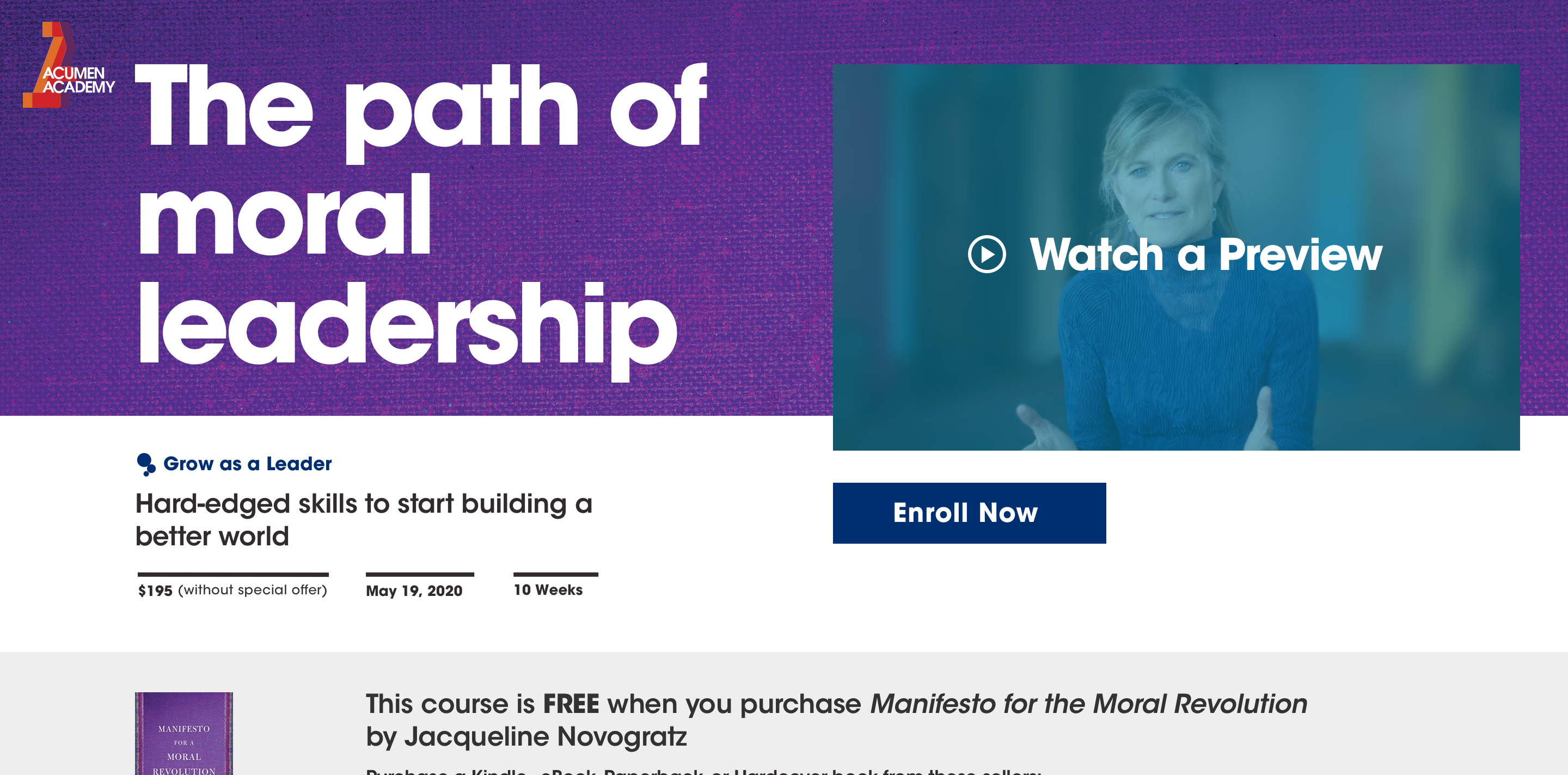
At this point, the team had decided the price of the course, and thus had made new requests about the book promotion and financial aid. How all this information would be presented to the user above the fold was still up for debate.
Information at the Fold
The following are iterations I shared with the Director and Associate Directors of Acumen Academy to understand their priorities in information hierarchy above the fold. They preferred the last iteration because the white card brought out the information of the course more easily.
Book Banner
Knowing the book banner would go below a colorful hero image, I wanted to use a contrasting background color that would also make the book image pop. In the case that the team didn’t want to use a photo for the book, I explored our accent color as the background color. They went with option 5 or 6, because it seemed ‘less busy.’
Content Blocks
I mocked several options that re-used styles from other pages. The first three feature photos that are in a blue duo-tone that I was intially told we’d use. I created two more options that used more more color and broke up the grid. The team went with the 4th iteration once they saw the color photos with accent block text because they liked the playful energy they created.
Version 2
Incoporating all the feedback, this version emphasized the cource description as a white card above the book banner, and leads the user towards the value proposition and video preview.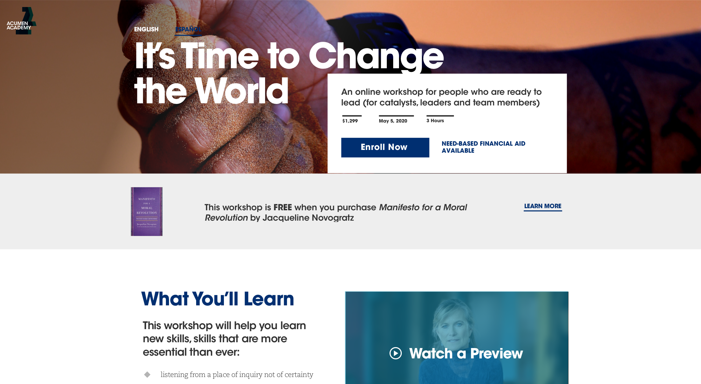
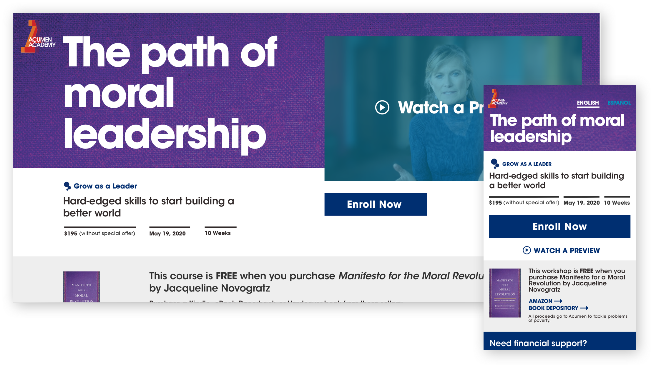
Final Version (3rd Iteration)
A week before launch, the branding/marketing team had finalized a few more assets, including the imagery and video for the course. the communications team felt the video preview should be seen above the fold, so I adjusted padding and sizing to make sure the user still was able to see the payment options. Financial aid however, would be the last of the priorities for viewers to see, as the goal was to get more people to buy the book than for financial aid to be distributed.
Desktop
In this version, the video preview replaced the course description card and moved it below as a full-width block. With some padding tweaks, the book banner still appears above the fold.
In this version, the video preview replaced the course description card and moved it below as a full-width block. With some padding tweaks, the book banner still appears above the fold.
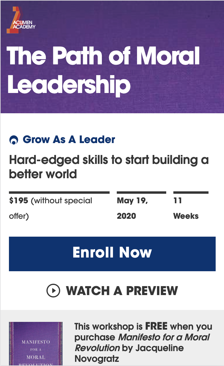
Mobile
Since the addition of a video preview would not fit above the fold, another solution was to just show the icon and text link.
Since the addition of a video preview would not fit above the fold, another solution was to just show the icon and text link.
Next Steps
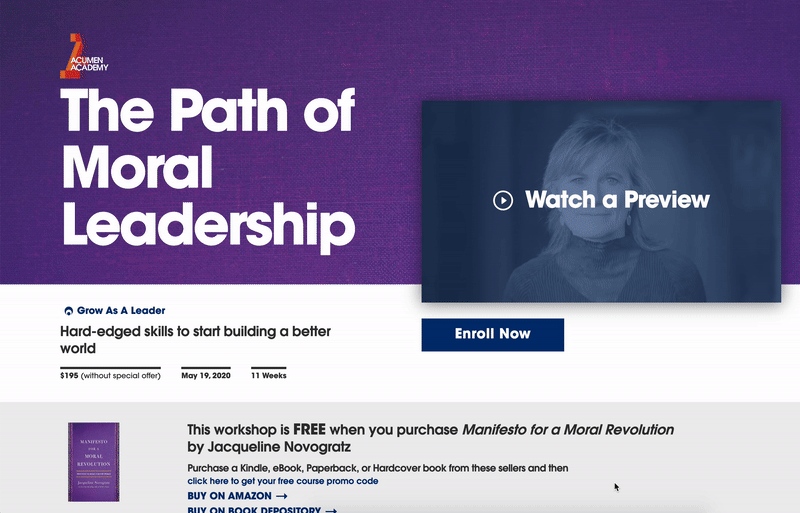
While there are still some UI/UX issues to QA on the live website, the short-form of the landing page has been built so far:
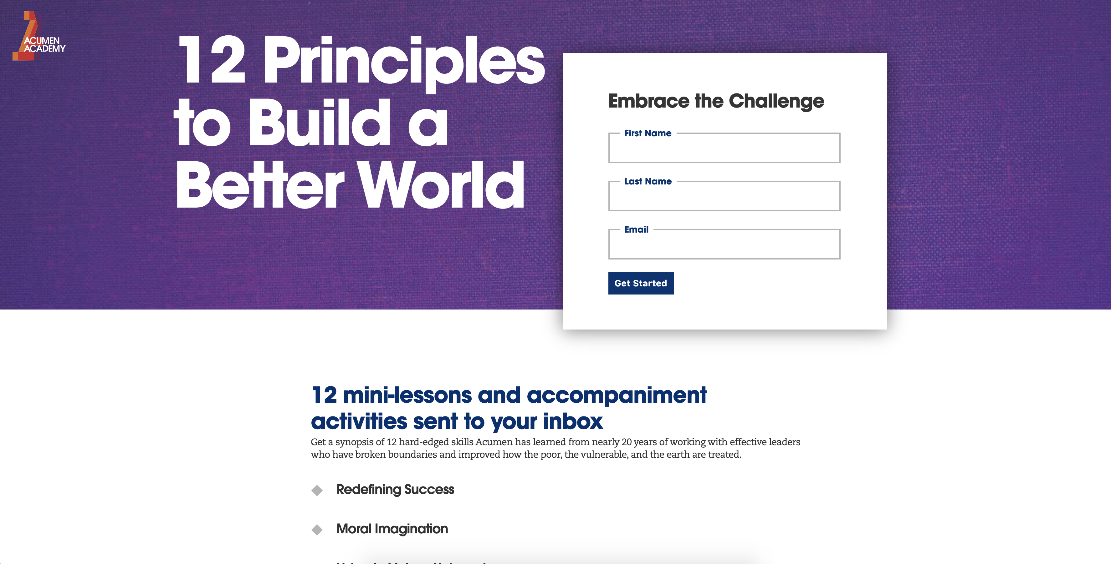
This design template is also taking on other forms, including one with an intake form for an email content marketing campaign: